How Much UI Autonomy Can a Product Handle?
Microfrontends promise technical autonomy. Teams can use different frameworks, develop their applications independently, and adapt their technical stack to the needs of their domain.
That freedom does not end only at domain dependencies or global platform capabilities. It also ends at the user interface.
To users, a product does not consist of hosts, remotes, frameworks, and deployment units. They see forms, buttons, tables, dialogs, and navigation. When one area looks or behaves differently from the next, they do not experience successful technical decoupling. They experience an inconsistent product.
This raises a question that appears smaller technically than it is organizationally:
How much visual and technical UI autonomy can individual remotes have before the shared product starts to fall apart?
The answer does not have to be forcing every remote onto the same framework and component library. That would remove a substantial part of the promised technical autonomy. An Angular remote may use Angular Material, while a React remote integrates Material UI or another suitable library. A third remote may work with utility classes.
Those technical differences do not have to be a problem for the product. They become a problem as soon as users can see or feel them.
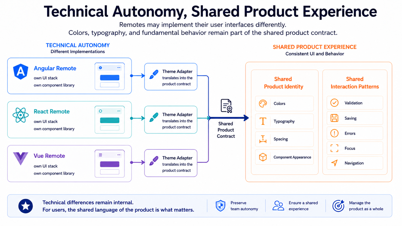
The remote owns the technical implementation. The product owns identity and behavior.
A Product Must Not Expose Its Architecture
Section titled “A Product Must Not Expose Its Architecture”Technical boundaries matter to the architecture. They should remain largely invisible in the product experience.
Users should not be able to tell from the interface that one page is rendered by Angular and the next by React. They should not notice that two forms come from different component libraries or that one remote was delivered independently from the rest of the product.
Visible remote boundaries can appear in many ways:
- Colors change when users move into another product area.
- Headings suddenly use different typography.
- Spacing becomes tighter or more generous.
- Buttons have different radii, heights, or states.
- Forms validate at different moments.
- Error messages appear in different places.
- Saving happens through a button in one area and automatically in another.
- Keyboard and focus behavior differ.
Each individual deviation may appear small. Together, they make the product feel like a collection of loosely connected applications.
Technical autonomy must therefore not be confused with visual arbitrariness. A remote may decide how to implement the shared product contract in its technical stack. It may not decide on its own what the product fundamentally looks like or how it behaves in that area.
UI autonomy ends where users can see the architecture.
The Technical Problem Is Surprisingly Simple
Section titled “The Technical Problem Is Surprisingly Simple”The basic technical rule for a consistent interface is remarkably simple.
A remote first uses the component library intended for its UI stack. It relies on the library’s public APIs, integrates the supported theming model, and connects that model to the shared product tokens. Spacing, colors, typography, radii, and states are not reinvented for every use case.
Where a utility layer has been agreed upon, the remote uses its defined design vocabulary. Where custom CSS is necessary, it still refers to semantic product values.
A sensible order is:
- Use an existing component from the UI library.
- Use the component’s public API.
- Use the official theming model.
- Apply defined design tokens.
- Use the agreed utility classes.
- Write limited local CSS based on semantic product tokens.
- Treat free values or custom components as explicitly justified exceptions.
This order is not an immutable law. It defines a useful burden of proof.
A custom component may be justified when the product needs a specialized domain visualization, when the library has a real gap, or when a browser workaround is necessary. A deliberately developed product-wide component can also justify such a deviation.
Weaker reasons include: “It was faster this way,” “I did not like the spacing,” or “It is only a few lines of CSS.”
Under these conditions, UI consistency is not a particularly difficult architecture problem. The tools exist. The integration points are known. The rules can be documented and, to some extent, automated.
The hard part is not the technical model. It is applying it consistently.
Why Reality Still Looks Different
Section titled “Why Reality Still Looks Different”In real projects, an inconsistent interface rarely begins with a deliberate decision against the design system. It emerges gradually.
A team needs a button whose spacing does not quite fit. A local rule corrects it. Another team wants a card to have slightly rounder corners. In a third remote, a form field is rebuilt because the API of the existing component initially appears more complicated than a few lines of HTML and CSS.
None of these decisions immediately breaks the product. Each one may appear locally reasonable.
The problem is repetition.
One custom spacing value becomes several. One adjusted color becomes a local palette. One rebuilt button gains variants for loading, errors, disabled states, and keyboard interaction. After a few years, a second, distributed UI platform exists alongside the official one.
That second platform has no name, no roadmap, and no team responsible for it. It consists of local selectors, overridden components, copied styles, and implicit conventions. Yet every visual or technical change must maintain it as well.
UI consistency rarely fails because a design system is missing. It fails because its rules are treated as optional.
A design system is not a catalog of non-binding suggestions. It is a product contract. When that contract is followed only when it happens to fit the local implementation, the product effectively no longer has a shared contract.
“If You’re Writing CSS, You’re Probably Doing Something Wrong”
Section titled ““If You’re Writing CSS, You’re Probably Doing Something Wrong””In one long-running project, a deliberately exaggerated phrase became established:
If you’re writing CSS, you’re probably doing something wrong.
The sentence does not claim that custom CSS is always wrong. An interface without project-specific CSS is neither always possible nor automatically desirable.
Its purpose is different: it reverses the burden of proof.
The shared UI and theming contract is the default. The component library, its public APIs, the design tokens, and the agreed utility classes form the intended path. Anyone leaving that path should be able to explain why the available mechanisms are insufficient.
Without this reversal, the opposite situation quickly emerges. The product contract has to defend itself against every local deviation:
Why can the button not be slightly taller? Why must the card use the same radius? Why is 13px a problem when it looks fine on the current screen?
The wrong question is why a team should follow the shared contract. The right question is why the specific deviation is necessary for the product.
The exception must justify itself against the product contract—not the product contract against the exception.
This attitude is not hostile to design work. It protects it. A design system only creates value when new requirements are first solved within its language. A justified gap can then be deliberately added to the product contract instead of remaining hidden as a local special case.
Custom CSS Can Bypass the Theming Contract
Section titled “Custom CSS Can Bypass the Theming Contract”Custom CSS is often discussed mainly as a maintenance problem. Long stylesheets, highly specific selectors, and hard-to-understand overrides are indeed problematic. For a product with several remotes, however, another issue matters even more:
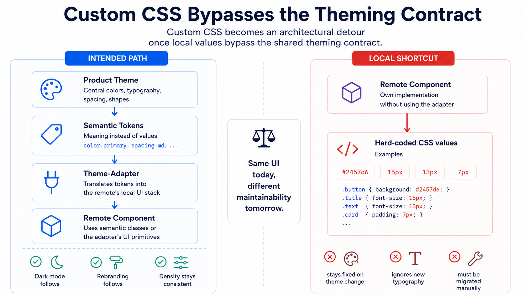
Custom CSS can bypass the central theming contract.
A local style may look correct today and still already be detached from the product’s future evolution.
.remote-card { color: #2457d6; font-size: 15px; padding: 13px; border-radius: 7px;}These values do not automatically react to a new corporate identity. They know nothing about dark mode, a changed typography scale, or a more compact density. New accessibility requirements or a later design-system migration will not necessarily reach them either.
The card works technically. But it no longer fully participates in the product theme.
Custom CSS that remains connected to the theme behaves differently:
.remote-card { color: var(--product-color-text); background: var(--product-color-surface); font: var(--product-typography-body); padding: var(--product-space-card-padding); border-radius: var(--product-radius-card);}This is still custom CSS. Its values, however, are not defined locally. The component remains connected to the semantic roles of the product.
When the interface changes centrally, the card can follow that change. The remote still owns its concrete rendering without opening a parallel design path.
Custom CSS is therefore not inherently the problem. Unthemed custom CSS is.
The more precise rule is:
Custom CSS may extend the product contract, but it must not bypass it.
A specialized domain visualization may need its own layout rules. A complex editor, a diagram, or a specialized planning component cannot always be assembled from standard building blocks. Even then, colors, typography, focus states, spacing, and contrast can still come from the shared contract.
The domain-specific requirement may justify a custom component. It does not automatically justify a separate visual language.
Use the Conventions of the UI Stack
Section titled “Use the Conventions of the UI Stack”An established component library provides more than a particular look. It takes over part of the long-term maintenance work.
A button is not merely a colored rectangle with text. It needs focus states, keyboard interaction, disabled behavior, loading states, and understandable contrast. A form field needs labels, error messages, state transitions, and meaningful integration into forms. Dialogs need focus management, escape behavior, and sensible treatment of the background.
Libraries such as Angular Material, Material UI, and comparable component-based systems provide APIs, conventions, and a central theming model for these concerns. They do not automatically solve every accessibility or UX problem. They do, however, reduce the amount of infrastructure a product must develop and maintain itself.
When teams regularly override these mechanisms, they gradually take that responsibility back.
A locally rebuilt component may initially require very little code. Later, it gains variants, validation, responsiveness, keyboard control, and adaptations for new browser versions. Every deviation increases the number of cases that library updates no longer cover.
The more heavily an established UI library is overridden, the more of its maintenance the product takes over itself.
Using a component library sensibly does not mean every product must look like the library’s default demo. The theme can adapt colors, typography, density, and other parameters to the product identity.
What matters is that the adaptation happens within the supported system. A configured library remains upgradable. A library assembled from many local overrides increasingly becomes a private fork, even when its source code was never actually copied.
Utility First Is Not Automatically Token First
Section titled “Utility First Is Not Automatically Token First”Utility classes can support the product contract very well.
They provide a constrained design vocabulary, make defined spacing and sizing immediately available, and avoid many freely named local CSS classes. A team can compose interfaces without inventing a new abstraction for every small layout decision.
This only works, however, when the utilities themselves are connected to the product contract.
Utility first is not automatically token first.
A utility system may still allow arbitrary values. An expression such as gap-[13px] is no better a product decision than gap: 13px. The notation is more compact, but the value is still invented locally.
The same applies to freely chosen colors, shadows, radii, or font sizes. A team can create its own design language with utility classes just as easily as with traditional stylesheets.
Tailwind, Bootstrap utilities, and similar approaches therefore do not automatically prevent a local design language. They can make a theme-aware, product-compliant path technically convenient. They cannot replace the required discipline.
The difference lies in the permitted vocabulary.
When semantic product tokens are exposed through utilities, a class for a primary action can refer to the corresponding role in the product theme. If its concrete color changes, the meaning of the class remains stable.
When only technical raw values are exposed, decisions such as “blue at level six” or “spacing four” spread through the code. Those names describe an implementation, not its role.
The tool can make following the contract easier. It cannot decide whether a local deviation is necessary for the domain.
The Product Owns the Theme
Section titled “The Product Owns the Theme”A shared theme should not be coupled to one particular framework. Otherwise, the product’s visual identity would depend on the technical implementation of a single remote.
The shared layer therefore needs semantic product tokens:
:root {  --product-color-primary-action: ...;  --product-color-danger: ...;  --product-color-surface: ...;  --product-color-text: ...;  --product-color-text-muted: ...;
  --product-typography-heading: ...;  --product-typography-body: ...;  --product-typography-label: ...;
  --product-space-card-padding: ...;  --product-space-content-gap: ...;  --product-space-section: ...;
  --product-radius-control: ...;  --product-radius-card: ...;  --product-control-height: ...;}
These names primarily describe meaning, not a concrete value.
Names such as blue-600, gray-100, or spacing-4 are closer to the technical representation. They may be useful as raw values inside a design system, but they are less stable as the public product contract.
A primary action may be blue today. After a new corporate identity is introduced, it may use a different color. Its role remains a primary action. Terms such as primary-action, danger, surface, text-muted, control-height, or content-spacing are therefore more meaningful over time.
Semantic tokens also support multiple product contexts. Dark mode can map the same role differently. A compact view can reduce control height. A higher-contrast theme can change colors without requiring every remote to reinterpret its components.
The product decides what a value means. The remote decides how its UI stack represents that value technically.
The contract therefore remains framework-neutral. An Angular remote may translate the product tokens into an Angular Material theme. A React remote maps them into the theme of its component library. A utility-based stack adopts them in its configuration.
The technical form may differ. The semantic roles remain shared.
One Adapter per Remote, Not a Separate Identity
Section titled “One Adapter per Remote, Not a Separate Identity”Different UI stacks require different integrations. That is not a flaw. It is a natural consequence of technical autonomy.
One possible model looks like this:
Product Tokens├── Angular Material Theme├── Material UI Theme├── Tailwind Configuration├── Bootstrap Configuration└── Limited Custom CSSEach branch translates the same product contract into the language of the respective stack. The adapters may differ substantially at a technical level. They do not need identical APIs or identical internal mechanisms.
A different model would be problematic: every remote defines its own colors, typography, density, radii, form states, error messages, and interaction patterns. In that case, the product does not have several technical adapters. It has several product identities.
A custom technical theme is fine. A custom product language is not.
The host or product platform determines the active product context. This may include the current theme, density, language, or other global settings. The remote receives that context through a stable contract and translates it into its technical environment.
The host does not need to know the remote’s component library or control its internal theme implementation. It provides meaning and context, not component-specific instructions.
The boundary remains clear: the platform owns the product theme. The remote owns the adapter.
Put more pointedly:
One theme adapter per remote—not one corporate identity per remote.
The Mini Host Provides the Same Contract
Section titled “The Mini Host Provides the Same Contract”Dynamic remotes should be developable and testable independently of the real host, for example through a mini host that provides the same theme and token contract locally.
What matters is that this mini host does not create a second visual reality. Invented test colors or simplified local styles may appear convenient at first. They cause the remote to be viewed under different conditions during development than it will encounter in the actual product. Problems with contrast, spacing, density, or theme changes then become visible only during integration.
The mini host should therefore use the same semantic roles and the same contract structure as the real host. It may provide several defined test themes to cover light, dark, compact, or high-contrast variants.
The mini host does not replace the product platform. It provides its contracts for development and testing.
Design Tokens Do Not Standardize Behavior
Section titled “Design Tokens Do Not Standardize Behavior”A product can use the same colors, spacing, and fonts and still feel inconsistent.
Remote A validates a form field when the user leaves it. Remote B displays errors only after submission. Remote C introduces new error messages after every keystroke.
All three forms may use the same design tokens. The person at the screen still has to reorient themselves in every area.
The same applies to saving. One remote uses a clear primary button. Another saves automatically. A third hides the action behind a barely explained toolbar icon. Each solution may be defensible in isolation. Without a shared product context, however, they create contradictory expectations.
Design systems therefore need shared interaction patterns in addition to visual tokens.
These include decisions about:
- form validation
- saving and canceling
- loading states
- error handling
- notifications
- confirmation dialogs
- destructive actions
- focus management and keyboard interaction
- navigation
- empty states
- tables and filters
Not every detail must be implemented identically in every remote. A complex editor needs different interactions from a simple master-data form. Shared patterns nevertheless define the default and the expectations from which a product may deviate deliberately.
A destructive action should not execute immediately in one remote, require a confirmation dialog in the next, and rely on a temporary undo option in a third unless those differences are explained by the domain.
Design tokens standardize values. Interaction patterns standardize behavior.
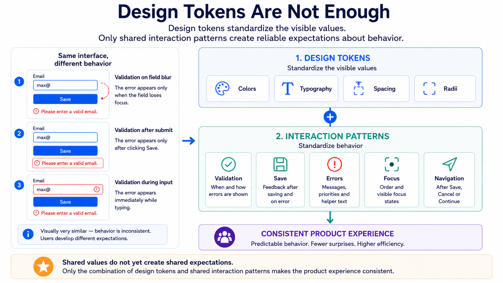
The product therefore owns more than colors and typography. It also owns fundamental expectations about how its interface behaves.
The burden of proof for exceptions applies here as well. Domain requirements may justify a different pattern. A team’s preference should not.
Global UI Surfaces Need an Owner
Section titled “Global UI Surfaces Need an Owner”Modals, overlays, and toasts belong to the same category of interaction patterns, but with one difference: they are not local UI inside a single remote. They sit on top of the entire product.
Without an explicit contract, their owner emerges by accident. Whichever remote happens to open an overlay first casually decides the stacking context, focus behavior, and ARIA semantics—regardless of which remote needs a dialog next. A modal that a remote renders only inside its own DOM region is encapsulated technically, but not product-wide: focus trapping, escape behavior, and how the background is handled affect the entire page, not just the area that opened it.
The same principle that applies to notifications applies here: global UI surfaces are a platform capability, not the property of whichever remote happens to render first. The platform provides a shared contract for modals, overlays, and toasts—including focus management and semantic structure. The remote triggers what should be shown through that contract. It does not manage on its own where in the DOM that surface lives or who gets focus back after it closes.
Global UI surfaces need explicit platform or product ownership. They should not emerge from whichever remote happens to own the DOM at the time.
Where Web Components Can Help
Section titled “Where Web Components Can Help”When several frameworks need the same visual building blocks, Web Components appear to be an obvious solution. They allow one implementation to be embedded in a largely framework-neutral way.
For some components, that can make sense:
- brand-defining elements used across frameworks
- small global platform components
- clearly encapsulated specialized components
- building blocks whose DOM and behavior should genuinely remain identical
A brand-defining product element, a framework-spanning control, or a highly specialized visualization may be provided more consistently as a Web Component than through several independent reimplementations.
For that specific building block, the risk of visual and functional drift decreases.
The benefit must not be confused with a free abstraction. Web Components need their own contracts for properties and events. They must be integrated into the form and state models of different frameworks. Accessibility, focus management, and keyboard behavior remain the responsibility of the implementation. Additional framework adapters, test stages, and release processes often emerge.
The shared component also has to be versioned, documented, and maintained over time. It is therefore a platform product, not merely a neutral technical container.
Web Components can standardize selected shared building blocks. They do not automatically replace a complete design system.
Shadow DOM, in particular, solves neither the organizational coordination problem nor the question of visual identity. An encapsulated component can still contain the wrong colors, unsuitable spacing, or inconsistent interactions. Encapsulation prevents unwanted interference. It does not automatically create a good product contract.
The Economic Cost of Visible Autonomy
Section titled “The Economic Cost of Visible Autonomy”Local UI autonomy has real benefits.
A team can make decisions more quickly, use the strengths of its framework more effectively, and work independently of a central component roadmap. Less coordination can create more speed in the short term.
That calculation remains incomplete as long as it considers only the cost of the individual team.
More local freedom may require several theme adapters, additional visual regression tests, and repeated accessibility reviews. The number of variants grows. UX governance becomes more demanding. Migrations have to span different libraries and local special cases.
What teams save in coordination through local UI freedom may later be repaid by the product as harmonization cost.
The difference becomes especially visible during larger changes.
When a new corporate identity is consistently connected through product tokens and technical adapters, much of the transition can be prepared centrally. Individual remotes update their adapters, verify the result, and correct a limited number of special cases.
When the product contains many free color values, local typography rules, and overridden components, the same change becomes a distributed migration. Every remote has to be searched, assessed, and adapted. Visual differences often become apparent only in screenshots or in the integrated product.
A local saving may be paid again by many teams years later.
UI autonomy is cheap locally and expensive globally once users can see it.
This does not mean that several UI stacks are always economically wrong. The additional complexity may be justified when different domain areas, lifecycles, or team structures benefit from it.
It should simply be treated as a real product investment. Every additional stack needs a reliable theme adapter, tests, and expertise. Every justified deviation increases the long-term maintenance surface.
Technical variety, in other words, does not cost nothing—but visible inconsistency usually costs more, because it burdens not only development but also users’ trust and orientation.
Governance, Not Centralism
Section titled “Governance, Not Centralism”A shared UI contract does not mean that one central team must approve every CSS class.
Such an organization would undermine the benefits of autonomous teams and turn the product contract itself into a bottleneck. Good governance is not micromanagement. It consists of clear boundaries that are easy to use.
The intended mechanisms therefore have to be practically available:
- Product tokens are technically accessible.
- Themes can be integrated with reasonable effort.
- A mini host provides the product context.
- Components and interaction patterns are documented.
- Agreed utility classes cover common layouts.
- Accessibility foundations are prepared.
- Local and automated testing are possible.
A contract that is unnecessarily difficult to follow will be bypassed more often in practice. When using the correct token requires several dependencies and lengthy coordination while a free CSS value works immediately, the platform itself creates an incentive to deviate.
Governance must therefore take both sides seriously.
Teams are responsible for not bypassing existing contracts for convenience. The platform is responsible for making the correct path the easiest reasonable path.
Automated rules can help. Linting can identify certain free values. Visual tests can verify theme variants. Documented reference implementations can demonstrate common forms, tables, and states.
Not every deviation can be prevented technically. Nor does it need to be. What matters is that deviations remain visible, deliberate, and justifiable.
A team may own the code of its remote and work with substantial autonomy within the agreed boundaries. It does not own the visual identity of the entire product.
UI Autonomy Ends at the Product Experience
Section titled “UI Autonomy Ends at the Product Experience”Technical UI autonomy is useful as long as it operates within a shared product contract.
Remotes may use different frameworks, component libraries, and technical theme implementations. A sense of belonging does not come from identical technology. It comes from shared semantic roles and behavioral patterns.
Theme adapters, component APIs, and agreed utilities form the default path. Custom CSS and custom components remain possible, but they carry the burden of proof and must remain connected to the product contract.
Inconsistent interfaces rarely emerge over the years because no theme exists. They emerge because small local exceptions eventually stop being treated as exceptions. A handful of free values gradually becomes a parallel design language whose later harmonization has to be paid for across all remotes.
UI autonomy ends where users can see the architecture.